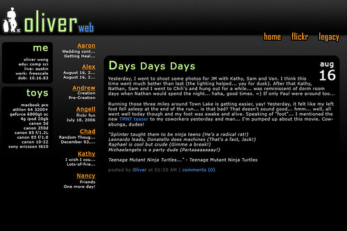
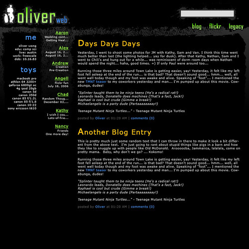
Okay, so the new OliverWEB design has been pretty much stagnant for a while and I’m wondering if I should keep it under wraps for another month to play with and possibly tweak and improve more or just go ahead and switch to it a month early (I think this makes up for the year I was late… at least I think I was late one year… ;).
Anyways, if I switched now, I could focus on owiber.com and what I want to do with that a month earlier… if not, I’ll just continue staring at the new design and maybe or maybe not improve upon it. What do you guys think? =)
While we’re on the topic, I’ll show you one of the designs I ended up scrapping:
I decided I wanted something lighter/cleaner. I also made a “messy” version of it, which I didn’t like that much…
I decided to go with a clean design and I think I did pretty well. The new one also uses a color scheme that is quite a bit different from any of my previous designs (yay!). But you can’t see it until I’m done (actually, truth be told, probably a ton of people have seen it in various states already, since I haven’t exactly been working on it behind lock and key… hehe).

